The continued development and evolution of GIS web applications has opened new pathways to visualising data, transforming the role that location plays in communicating and understanding complex layers of information.
From its inception, GIS has emphasised the geographic element of data. The current definition of a GIS from Esri is:
A geographic information system (GIS) is a framework for gathering, managing, and analyzing data. Rooted in the science of geography, GIS integrates many types of data. It analyses spatial location and organises layers of information into visualizations using maps and 3D scenes.1
Essentially, we still define GIS as a visualisation of data in map form to display information. Whilst this is definitely an accurate definition, it also limits the way we can push GIS into new domains.
Consider the following map made by the U.S. Department of Transportation in 2008.
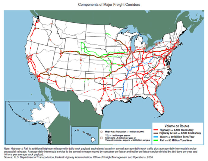
This map clearly shows the major freight routes across the United States by transportation method and annual tonnage. Due to the emphasis of geography, this map has highlighted the location of roads and rail lines in the country, with a degree of information as to their use.
Now compare that map to this Dashboard:
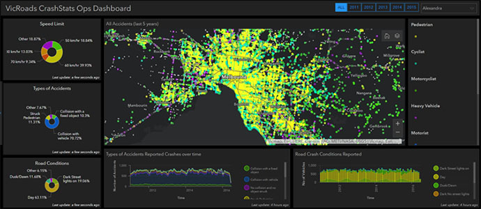
The map at the centre of this Dashboard is showing all car accidents in Melbourne, with the surrounding charts and infographics providing detailed information regarding the Speed Limit, Accident Type, Road & Weather Conditions, trends over time, and comparisons between multiple data types to establish more detailed trends.
As a standalone map, it provides information regarding density of accidents in high-population areas. When combined with the charts and infographics, we are able to obtain far more information about traffic incidents in Melbourne, including statistically likely contributing factors.
Also of note is this example of a page from Insights for ArcGIS.
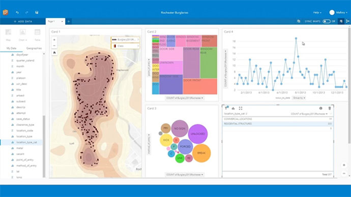
Data regarding burglaries in 2013 has been added to this Insights Page. The density of burglaries can be instantly assessed on the map to the left, and the charts in the middle give immediate insights into the point and method of entry.
On the right we can see the number burglaries across the year as well as the number of commercial and residential buildings affected. This brief glance has already given us incredible insight into the trends of burglaries, from both a spatial perspective and their associated attributes. Insights for ArcGIS is also able to link the datasets to the map. Clicking on the “Forced” bubble would highlight the points on the map that indicate a forced entry, bringing even more detailed insight and information from the data.
Geography and location analytics will always be the central tenant of GIS, that much is indisputable. What we have seen it that the GIS of ten years ago showed geographic data with additional information attached.
With the evolution of data visualisation tools such as Insights for ArcGIS and ArcGIS Dashboard, we are now at the start of an era where diverse collections of information can be viewed in their geographic context, bringing even greater insight into GIS.
To find out more about data visualisation capabilities in ArcGIS, check out the complete product list, call 1800 870 750 or send us an email.