The UK’s EU referendum will go down for many as the biggest vote in their lifetime, so it’s no surprise there was large voter turnout across Great Britain and Northern Ireland.
To break down the count for readers of The Times, Esri UK developed an interactive map showing the strength of majority in each local authority – which was dynamically updated with content in real-time as results rolled in.
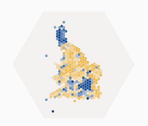
The best thing about this map is its simplicity. It transforms more than 33 million opinions into an easy-to-understand guide highlighting where the majority of UK citizens see their future.
People could immediately identify how the referendum played out around the country, with the obvious contrast of shades between the yellow and blue colours clearly showing the way each authority voted.
Delve deeper into the Brexit vote, and learn more about the polling trends that changed the direction of a nation.