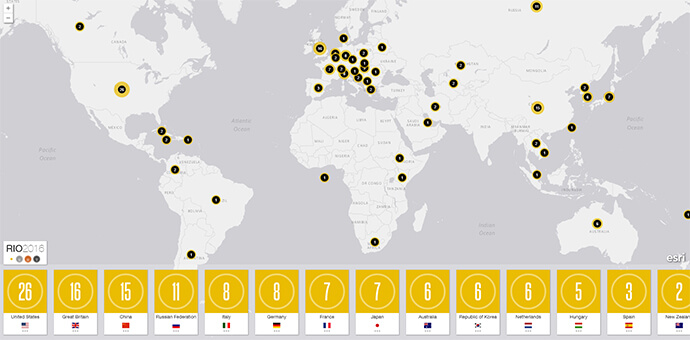
With the 2016 Rio Olympic medal tally dominated by the usual suspects like the USA and China, it’s great to see new faces joining the winners on this medal map, with Singapore, Fiji and Puerto Rico all securing their first gold medals.
While winning a medal at the Olympic Games may be the pinnacle of individual achievement for the world’s top athletes, the rest of us mere mortals are content with thought of beating our national rivals in the overall medal count.
With the first week of the 2016 Olympics already over, it is time to take a look at how Australia is travelling compared to the rest of the world.
Turning the traditional medal table on its head, this interactive map provides a real-time visual tally, plotting the number of gold, silver, bronze and total medals secured against each country.
The engaging map demonstrates an entertaining way to visualise data that is usually trapped in a table – allowing everyone to see the spread of medals across the globe and determine the most successful regions.
Take a moment to investigate this interactive medal tally map and find out which countries are spent the most time on the dais at the 2016 games.